
Overview
Overview
If the coming-of-age movies of our youth taught us anything, it was that American Summer Camps were the perfect antidote to having spent two years in dusty, sixth-form common rooms.
As a result, around 10,000+ students travel to the States each summer to work as Camp Councillors, facilitated by UK travel providers. The largest of which is 'Camp America', an organisation so well recognised that its name has become interchangeable with the experience itself.
With fierce competition for market share, their rival, the industry's second-largest provider, Camp Leaders, needed to find a way to challenge the status quo.
With Camp America and Camp Leaders offering almost identical packages to participants, designing for authentic user needs could transcend brand recognition in a market crowded with design and UX as dusty as those sixth-form common rooms.
Role: Lead Researcher and UX Designer (Contract)
Role: Lead Researcher and UX Designer (Contract)
Role: Lead Researcher and UX Designer (Contract)
Design soundtrack: Modest Mouse
Design soundtrack: Modest Mouse
Design soundtrack: Modest Mouse

Responsibility: Sole research and design responsibility. Project collaboration with Engineering & Marketing.
Responsibility: Sole research and design responsibility. Project collaboration with Engineering & Marketing.
Responsibility: Sole research and design responsibility. Project collaboration with Engineering & Marketing.

garlic chicken & Cognitive bias
Have you ever tried following a recipe with someone else in the kitchen? Inevitably, we end up second-guessing how much garlic we should really add and going full Marco Pierre White on the spring onions.
The same phenomenon occurs when we set study participants' instructions to follow under observation; they deviate from their natural behaviour; this is known as the 'Hawthorne effect', and it can have a profound impact on the reliability of research data, not to mention how garlicky the chicken will be.
Given the importance of identifying authentic user needs during this project, my research needed to balance observed and unobserved methodologies to reduce the likelihood of bias and ensure that the needs presented were genuine.
Research
Don't ask, observe
Rather than begin by asking participants what they wanted, I spent time at the start of the project auditing what users were already doing using existing quantitative data and experience monitoring software (Full Story).
As this data was unaffected by bias, it allowed me a reliable base from which to make observations, which I then grouped into hypotheses for further testing.
Methodologies utilised
Fullstory Recording - One month period, 2,000 interactions
Heatmap Analysis - Twelve-month period, 11,977 interactions
Unmoderated Testing - 15 independent testers
Fullstory Recording - One month period, 2,000 interactions
Heatmap Analysis - Twelve-month period, 11,977 interactions
Unmoderated Testing - 15 independent testers
Fullstory Recording - One month period, 2,000 interactions
Heatmap Analysis - Twelve-month period, 11,977 interactions
Unmoderated Testing - 15 independent testers
Observation
The bounce rate is 10% higher on mobile devices, which has been attributed to the site's responsiveness on a smaller scale.
However, this is speculative and should be investigated to determine how user journeys differ on mobile and whether the nature of the current mobile design affects the completion of these.
Methodology
User Interviews: To clarify whether tasks are completed on desktop instead of mobile and vice versa.
Unmoderated testing: To identify issues with the responsiveness of the design on a reduced scale.
User Interviews: To clarify whether tasks are completed on desktop instead of mobile and vice versa.
Unmoderated testing: To identify issues with the responsiveness of the design on a reduced scale.
User Interviews: To clarify whether tasks are completed on desktop instead of mobile and vice versa.
Unmoderated testing: To identify issues with the responsiveness of the design on a reduced scale.
With my hypotheses ready for test, I armed myself with Red Vines and Doughnuts and set up camp, no pun intended, at two of Camp Leader's job fairs. These yearly events attract hundreds of prospective councillors looking to connect with summer camps exhibiting at the fair.
Over the course of four fairs, I conducted several studies with 200 participants, investigating everything from design preferences to navigational understanding.


Methodologies utilised
User Focus Groups x 5 - Sample Size 10 participants per group
Card Sort Testing - Sample Size 40 participants
Treejack Testing - Sample Size 40 participants
Design Desirability Study - Sample Size 50 participants
User Interviews - Sample Size 20
User Focus Groups x 5 - Sample Size 10 participants per group
Card Sort Testing - Sample Size 40 participants
Treejack Testing - Sample Size 40 participants
Design Desirability Study - Sample Size 50 participants
User Interviews - Sample Size 20
User Focus Groups x 5 - Sample Size 10 participants per group
Card Sort Testing - Sample Size 40 participants
Treejack Testing - Sample Size 40 participants
Design Desirability Study - Sample Size 50 participants
User Interviews - Sample Size 20
To reduce bias, I split my tests using observed and unobserved methodologies. I differentiated myself from Camp Leaders staff and informed participants of my role as a consultant with no bearing on their camp applications. Briefings and informed consent forms detailed how data would be anonymised as well as the purpose of the research.
To reduce bias, I split my tests using observed and unobserved methodologies. I differentiated myself from Camp Leaders staff and informed participants of my role as a consultant with no bearing on their camp applications. Briefings and informed consent forms detailed how data would be anonymised as well as the purpose of the research.

the gamification of testing
My initial analysis quickly found that the Camp Leaders website navigation was confusing for users, evidenced by high page bounce rates and rage clicks a-plenty.
I suspected this was due to the jargon used within the navigation and a need for a state-specific hierarchy, e.g., pre-application, post-application, etc.
To investigate this hypothesis, I used treejack testing at the fairs, running software on an iPad that was free for anyone to interact with without observation. Participants were asked to demonstrate how they would complete a task or find information using our existing site map.

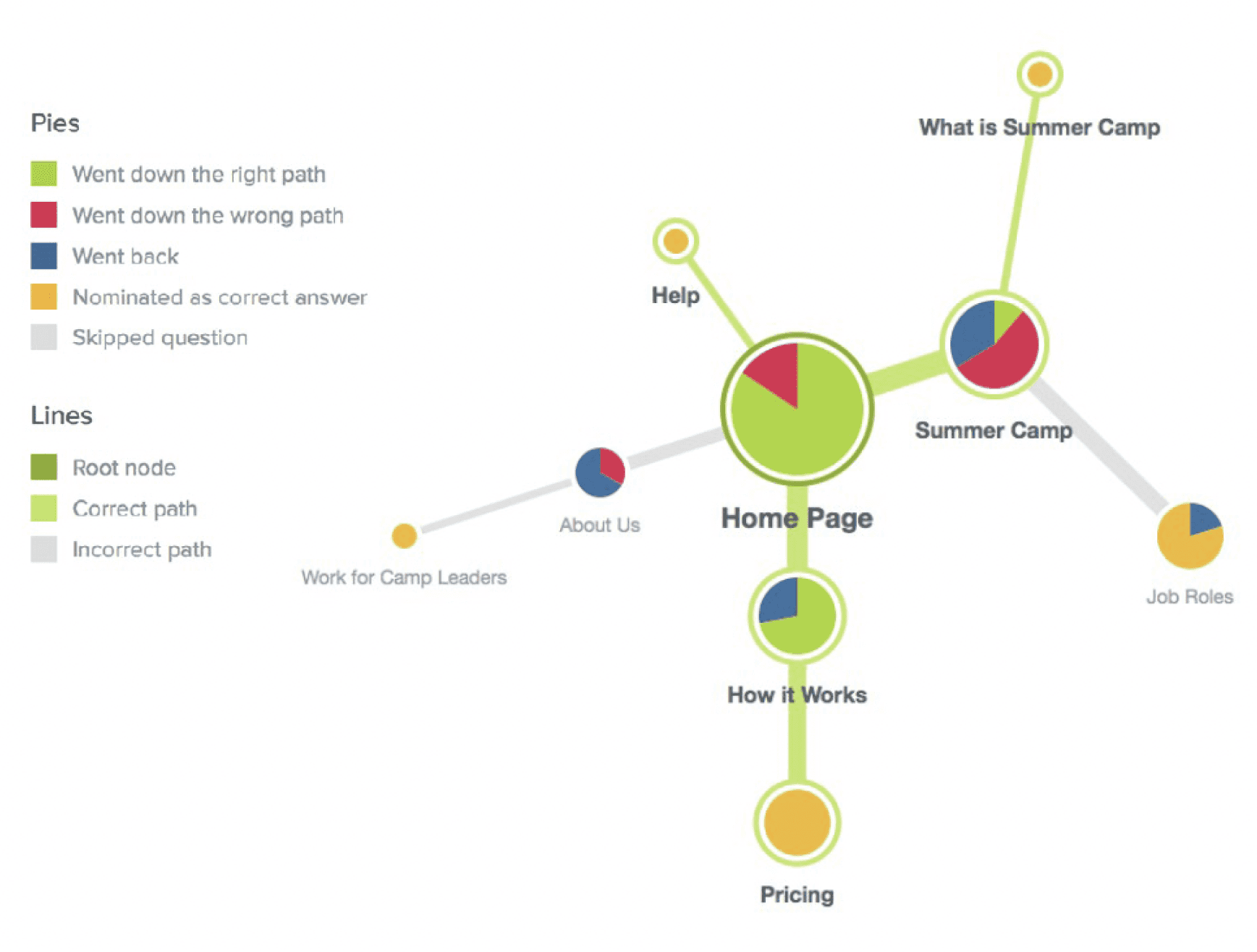
This testing method proved popular, likely due to the study's game-like quality, and I gathered enough data to visually illustrate the issues caused by confusing terminology and a lack of structure. This visual representation resonated particularly well with time-poor stakeholders, as well as the wider non-technical team.
This testing method proved popular, likely due to the study's game-like quality, and I gathered enough data to visually illustrate the issues caused by confusing terminology and a lack of structure. This visual representation resonated particularly well with time-poor stakeholders, as well as the wider non-technical team.
Reporting
holistic recommendations
No designer is an island, and once my research was concluded, I knew I needed the expertise of colleagues alongside my data to make holistic recommendations.
I set up a working group and produced a detailed research report for colleagues who wanted a deeper analysis. This collaboration proved successful, and I was able to cross-reference each hypothesis with relevant research and broader guidance before making redesign recommendations.
Results
The majority of participants reported that they typically use their mobile phones for quick information gathering, whereas they use their desktop devices for more official tasks.
According to the feedback received, all participants could complete the program application on their mobile devices, but they chose to use their desktops instead. They felt that a desktop made the process more official and provided a more significant writing space. They also mentioned that they didn't want to miss anything, which they thought could happen on mobile devices due to their smaller screens.
Only one participant completed the entire application on their phone. They found the experience to be "fine" but mentioned that it was challenging when it came to inputting a large amount of text.
Recommendations
Research indicates that mobile users are more goal-oriented than desktop users due to the nature of the device. Therefore, information should be more focused, tasks quicker to accomplish, and distractions or interruptions catered for.
The mobile site should not simply be a responsive version of desktop site. Instead, content should be organised to help mobile users achieve their goals more easily. This can be done by heroing clearer paths, such as "Contact" and "Login."
For better mobile usability, implement expanding input fields for users who want to apply via mobile.
Design
Postive Friction Only
Red, White & blue, with a twist
One recurring theme in my research was how infantilised participants felt by the design employed by most of Camp Leaders' competitors. American flags, cutesy illustrations, and animated instruction videos gave participants little sense of what they could really expect from camp.
During the redesign, I worked closely with the marketing team to remove ambiguous animation and replace it with photography taken by the team the year before. The images were engaging, authentic, and largely without a star-spangled banner in sight.


In addition to modernising the brand, I implemented devices to help support the user in their jounrey, such as hierarchy, white space, and content design.
Based on my report, more specific design recommendations were then applied.
The following resulted from the research conducted around mobile-first behaviours.
As per user feedback, the navigation was revised and the content grouped into stage-specific sections. The sections were designed in accordance with Hicks’ Law to avoid overwhelming users.
A mobile navigation has been designed specifically for goal-oriented tasks that occur predominantly on mobile devices, such as contacting the team or checking the status of an application.
The page layout has been revised to include generous headers that allow users to easily scan for goal-oriented solutions. Additionally, a rhythm has been introduced through the use of shape and colour, which guides the user's eye and groups related content.
Links within the site now use design techniques like colour and iconography to reintroduce signifiers of affordance. This approach makes better use of space and helps users navigate content more intuitively.
Results

23% increase in sign ups post release
23% increase in sign ups
Following the redesign sign-ups increased by 23% the following season, with a reduction in service calls of almost a third, owing to the clarity of the content provided.
Camp Leaders now outranks direct competitor Camp America on all review sites for their service. The website has been referenced multiple times as "very user-friendly and easy to navigate".